“A picture says more than 1000 words.”
I don’t know the source of that quote, but for sure it is true for every developer and engineer too. Engineers need to work a lot with numbers. But numbers can be transformed into pictures and graphs which can make complex things and relationships easier to understand. Verifying proper functionality of a PID closed loop controller or watching sensor values with a nice plot is definitely something very useful. Would it not be great to watch sensor data changing over time in a chart like the one below?
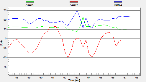
Accelerometer Graph
One way is to export data and then show it e.g. in Excel (which has been great chart functions). But even better, if this could be done directly with data provided from the target board? If you think this is hard to do, then I can show you how this can be done in a few steps with the help of a very nice tool: FreeMASTER 🙂
Continue reading →