
With the NXP MCU-Link Pro I can measure current and power/energy of an embedded target. In this article I describe how I can use and visualize that data in VS Code:
Outline
The NXP MCU-Link Pro is a debug probe which integrated current/power measurement circuit. The MCUXpresso Eclipse based IDE includes a viewer for the collected analysis data (see “MCU-Link Pro”: Debug Probe with Energy Measurement). In this article I describe how I import and use the data with VS Code. I’m using two methods for visualize the data in VS Code: Python with Pandas and Gnuplot.
Prerequisite
In VS Code, I have the following extensions installed:
- MCUXpresso for VS Code (nxpsemiconductors.mcuxpresso)
- Python (ms-python.python)
- Gnuplot Preview (fizzybreezy.gnuplot)
- Optional: Rainbow CSV (mechatroner.rainbow-csv)
For using Gnuplot: install it from http://www.gnuplot.info/. Make sure Gnuplot is in the PATH.
For using Python/Pandas: I’m using Python 3.13.3 with pandas and mathglotlib:
pip install pandas matplotlib
Importing with NXP Extension
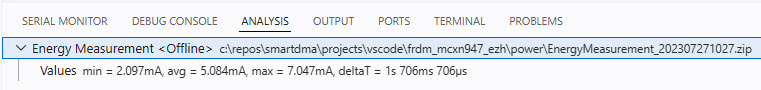
Analysis data in .zip format from the MCU-Link Pro (or from evaluation board circuits, if present) can be imported with VS Code:
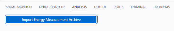
After importing the data, it shows this:
CSV
The data can be easily converted into a .csv format, see Data Converter for MCUXpresso Energy Measurement Data. That way the data can be visualized with any tool which can consume .csv. Time is in microseconds with current in Milli-Ampere:
us,mA
1729032683.000000,6.772331
1729032703.000000,6.714966
1729032723.000000,6.747086
1729032743.000000,6.674423
...
Gnuplot
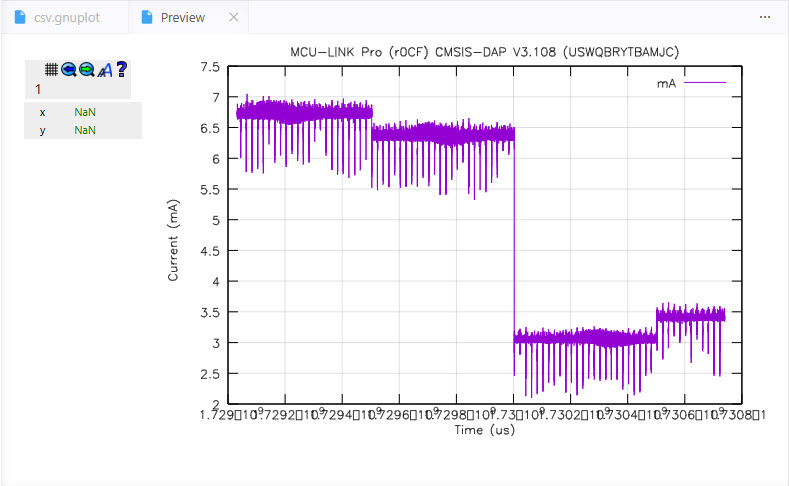
The power with the Gnuplot preview extension is that I can use the Gnuplot language script. Below is the script I used (csv.gnuplot):
# file: csv.gnuplot
set datafile separator ','          # CSV with comma as separator

set key autotitle columnhead        # use the first line as title
set ylabel "Current (mA)"           # label for the Y axis
set xlabel 'Time (us)'              # label for the X axis

set style line 100 lt 1 lc rgb "grey" lw 0.5    # linestyle for the grid
set grid ls 100                 # enable grid with specific linestyle

set title "MCU-LINK Pro (r0CF) CMSIS-DAP V3.108 (USWQBRYTBAMJC)"
plot "data.csv" using 1:2 with lines
In VS Code, open the gnuplot file in the editor and press CTRL+SPACE+P, then select GnuPlot: Preview Figure:
This opens the preview inside VS Code:
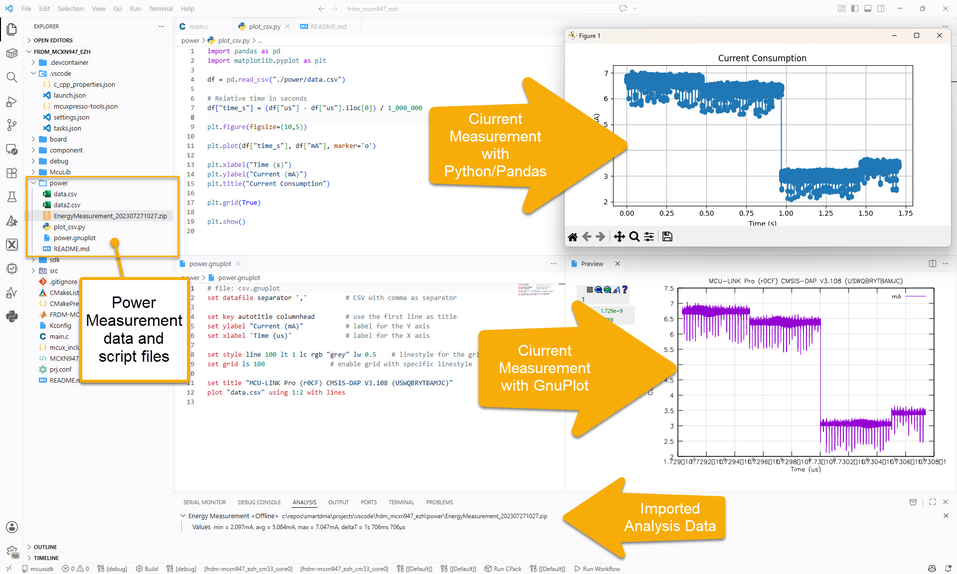
Python/Pandas
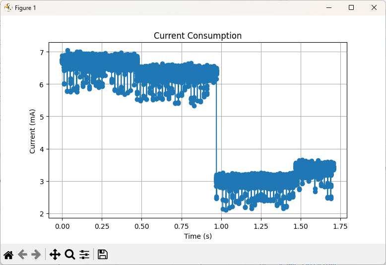
Another way is to use Python with Pandas. Below is a script I use as example:
import pandas as pd
import matplotlib.pyplot as plt

df = pd.read_csv("./power/data.csv")

# Relative time in seconds
df["time_s"] = (df["us"] - df["us"].iloc[0]) / 1_000_000

plt.figure(figsize=(10,5))

plt.plot(df["time_s"], df["mA"], marker='o')

plt.xlabel("Time (s)")
plt.ylabel("Current (mA)")
plt.title("Current Consumption")

plt.grid(True)

plt.show()
Run the script and it produces a data graph:
Summary
There are many ways how to visualize current consumption or power/energy data from the MCU-Link/LinkServer in VS Code. I like Gnuplot because this is what I’m using for documentation in LaTeX. Python/Pandas is a versatile tool to analyze and display data. Another way would be use Jupiter too. What I really like with VS Code: I have multiple options, and freedom of choice. And with the example of Gnuplot and Pandas: both work without VS Code too.
Happy analyzing 🙂
Links
- Gnuplot: http://www.gnuplot.info/
- Pandas Python Data Analysis Library: https://pandas.pydata.org/
- Data Converter for MCUXpresso Energy Measurement Data
- Data Converter Sources on GitHub: https://github.com/ErichStyger/mcuoneclipse/tree/master/MCU-Link/EnergyMeasurement
- NXP MCU-Link Pro web page: https://www.nxp.com/design/microcontrollers-developer-resources/mcu-link-pro-debug-probe:MCU-LINK-PRO
- New “MCU-Link Pro”: Debug Probe with Energy Measurement

Great tutorial Erich!
LikeLike
Thank you 🙂
LikeLike
Hi Erich,
I assume this approach is possible only when MCU is powered by the MCU Link Pro probe right?
I know a similar solution from Silicon Labs and Gecko board, but that was some years ago and it was a dedicated Eval Kit board with appropriate circuitry already set-up for this exact purpose.
LikeLike
Hi Micahel, the supply voltage *can* come from the MCU-Link Pro, but does not have to. The MCU-Link Pro is using a ‘shunt-based’ power measurement. You put the MCU-Link measurement between your power supply and the target. Or in other words: The MCU-Link measures the voltage drop in its measurement circuit, but is not the power supply.
I hope this helps?
LikeLike
Hi Erich,
Yeah it’s clear now. Even more after I watched a YT video (https://www.youtube.com/watch?v=Kor-_LZVhWw) showing the probe from up-close and the measurement utility as well
LikeLike
Hi Michael,
yes, that video can be very helpful if new to the MCU-Link Pro.
Erich
LikeLike